Viewing a Request's Details
This page explains the structure and functionality of a Statistics Request's Details page. You will learn which charts provide the most value, how to use filters to identify strategy improvements, and how to navigate the results effectively.
Open a Details Page
To navigate to the details of a specific Statistics Request, visit the My Statistics Requests page within the Tick2Tick Dashboard.
Locate the Request you wish to analyze from your list and click the Details button on the left side of the data grid. This will open the full analytical view for that specific simulation.
Summary Card
At the top of the Statistics Request's Details page is the Summary card. This section provides a high-level textual overview of the Request’s performance and configuration.
| Term | Definition |
|---|---|
| User Tag | Your custom label used for organizing and identifying the Request. |
| Automatic Tag | A system-generated string consisting of key settings concatenated for quick reference. |
| Request Timestamp | The time the Statistics Request was uploaded to our systems. |
| Instrument | The trading Instrument used for the strategy. |
| TF (Timeframe) | The timeframe settings (e.g., Range, Time, or Trades) and their specific values. |
| Avg. RR per Trade | The average Risk/Reward ratio achieved across all executed Trades. |
| Total Result (USD) | The final net profit or loss at the end of the simulation period. |
| Trade Count | The number of Signals that successfully converted into active Trades. |
| Avg. Trade Result (USD) | The average net result in USD across all executed Trades. |
| Max. Concurrent Trades | The maximum number of Trades active simultaneously and the timestamp when it occurred. |
| Max. Concurrent Quantities | The maximum number of Quantities active at once and the associated timestamp. |
| Max. Concurrent USD | The maximum total USD amount at risk at any single point in time. |
Description
Add a custom description (up to 250 characters) to each of your Statistics Requests. Use this space to document specific details, record your trading strategy, or leave reminders for future reference.
You can manage your descriptions using the Description card.
How to edit your description:
- Double-click the text area inside the card.
- Enter your notes. A counter will track your character usage in real-time.
- Click anywhere outside the text area to save your changes.
Example for editing the Description card's content:

Filtering
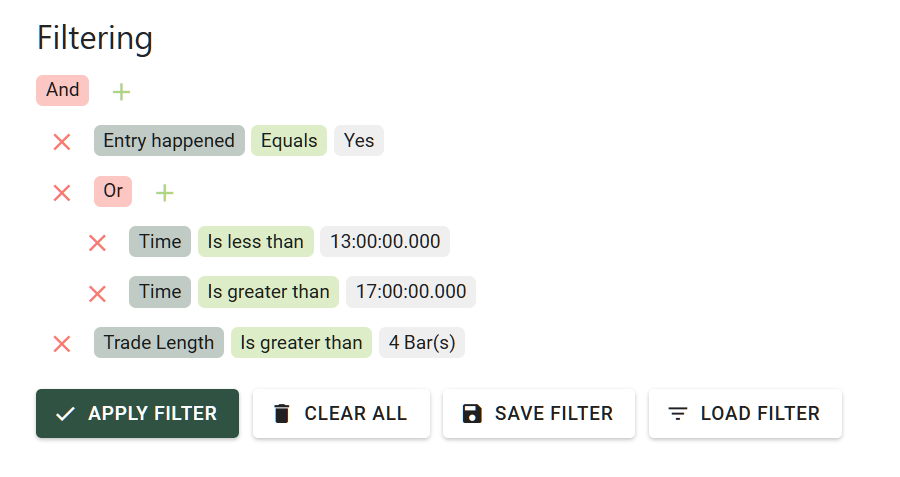
The Filter Builder allows you to isolate specific Trades within the Statistics Request to update the charts and graphs dynamically.
This is a critical feature for strategy refinement. By applying filters, you can get an immediate glimpse of how your strategy would have performed under specific conditions without needing to run a completely new simulation.
Signal Filter Templates
After you set up a filter, you can save it as a Signal Filter Template to use it later to filter any of your Requests.
You can view and manage your saved Signal Filter Templates on the My Signal Filter Templates page inside the Tick2Tick Dashboard. Access its documentation here.
Example for Signal Filtering:
Recommended Workflow
- Analyze: Review the initial strategy performance on the charts and graphs below.
- Hypothesize: Identify potential improvements (e.g., "Does this strategy fail during high-volatility sessions?").
- Filter: Narrow down the Trades based on these factors—for example, show only specific Setup Sizes or specific time windows.
- Validate: Once you find a filtered setup that looks promising, create a Fine-Tuned Statistics Request to verify the new logic and check for improved DrawDown metrics.
Filtered Summary Card
The card named Filtered Summary displays the performance metrics of the Statistics Request’s results specifically for the subset of Trades currently selected via the Filter Builder.
| Term | Definition |
|---|---|
| User Tag | Your custom label used for organizing and identifying the Request. |
| Avg. RR per Trade | The average Risk/Reward ratio across the currently filtered Trades. |
| Total Result (USD) | The final net profit or loss at the end of the simulation period. |
| Trade Count | The number of filtered Signals that successfully converted into active Trades. |
| Avg. Trade Result (USD) | The average result in USD across the filtered Trades. |
Equity Curve(s)
These charts visualize the progression of your account balance as the strategy develops.
If the Statistics Request contains Trades in only one direction, only a single Equity Curve will be visible.
The Equity Curves maintain chronological distance. This means that if there is a longer period with no active Trades, the chart will reflect this with a horizontal "gap" or flat line to accurately represent the passage of time.
Short and Long Direction Combined
This view displays the integrated results of both Short and Long Trades, showing your total account performance in a single line.
Short and/or Long Direction Separated
This view plots the Short and Long Trade results as separate lines, allowing you to compare the performance of each direction independently.
Asset Price Overlay
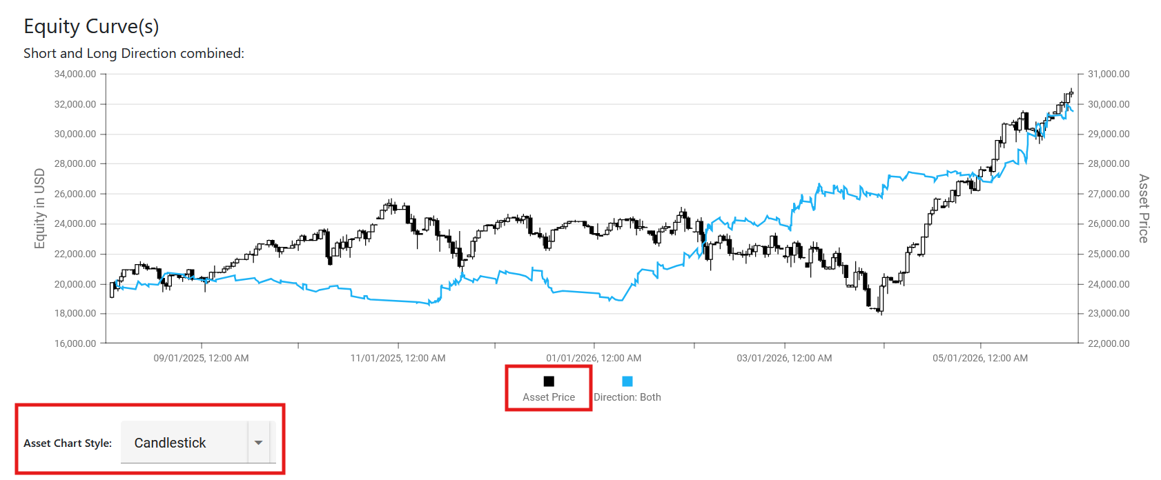
Unlock deeper market context with the Asset Price Overlay. This advanced feature allows you to plot the underlying Instrument's price directly beneath your Equity Curve, precisely synchronized to the date span of your strategy simulation.
Pro Feature: We designed this specifically for advanced market analysis. Overlaying the asset's price action against your strategy's performance allows you to visually identify correlations, evaluate how your system behaves in different market regimes (e.g., trending vs. ranging), and validate the overall robustness of your trading logic.
Technical Specifications
- Data Format: The chart displays daily OHLC (Open, High, Low, Close) values.
- Time Synchronization: Daily price data is calculated using the specific Session Times configured for each individual Statistics Request, ensuring accurate alignment with your trading window.
How to enable the overlay:
- Locate the legend beneath the chart and click the Asset Price icon to activate the series.
- Once activated, an Asset Chart Style dropdown will become visible.
- Select your preferred visual representation from the dropdown to format the price data.
Example for the Asset Price Overlay:
Pie Charts
Entry vs No Entry
This pie chart provides a breakdown of the total Signals within the Statistics Request, comparing how many successfully executed an Entry to become a Trade versus those that remained as Signals for which an Entry did not happen.
Winning vs Losing Trades
This pie chart illustrates the win/loss ratio of your executed Trades. It classifies a "Win" as any Trade with an RR above 0, and a "Loss" as any Trade that failed to reach a positive Risk/Reward ratio.
Distributions of Trade RRs
These histogram charts display how Trade RRs are distributed across 1-RR increments. This is highly effective for pinpointing specific RR regions where your strategy gains or loses the most value.
The platform provides both a standard and a logarithmically scaled version to ensure you can detect every relevant group of Trades. For instance, if most Trades reset in two major RR ranges that are far apart (e.g., -1 RR and +5 RR), the Trades occurring between them may be difficult to see on a normal scale. The logarithmically scaled chart ensures these smaller groups remain visible for analysis.
RR Cloud Chart
This bubble chart visualizes how Trades perform at various times of the day. The results are aggregated across the entire duration of the strategy's time period.
Each bubble represents:
- Direction: The trade direction (Long/Short) of the included Trades.
- Average RR: The average Risk/Reward ratio of the Trades in that cluster.
- Volume: The number of Trades contained within the bubble.
- Time of Day: The average time at which those Trades occurred.
This chart is a powerful tool for identifying which specific time periods are worth trading and which should be avoided.
If an area of Trades on the RR Cloud Chart shows consistently high performance, those times should be prioritized. Conversely, if an area shows poor performance, consider implementing a "Trading Break" during those hours.
Hourly RR Chart
This bar chart complements the RR Cloud Chart by displaying the average RR achieved during different parts of the day. Like the cloud chart, these results are aggregated over the strategy's entire timeframe.
Each bar represents:
- Direction: The trade direction of the included Trades.
- Average RR: The average Risk/Reward ratio for that specific hour.
- Trade Count: The total number of Trades that occurred in that hourly slot.
- Time: The specific hour of the day being measured.
While the RR Cloud shows individual clusters, the Hourly RR Chart provides a summarized, cumulative view. Using these two charts in tandem allows you to deeply understand your strategy’s performance profile throughout the trading day.
Aggregated Results in USD
This bar chart visualizes the strategy's performance over the simulation period. It supports multiple aggregation modes: Hour, Day, Week, and Month.
For each selected period, the chart displays:
- Sum of Result (USD): The net profit or loss for that specific timeframe.
- Broker Costs: The total commissions incurred during the same period.
- Total Performance: A dot-and-line overlay representing the sum of results and costs, allowing you to track performance trends across periods.
This chart is essential for evaluating profit margins against execution costs. For example, it helps identify if a strategy's profit is being eroded by high broker fees, which could result in a net loss despite a positive raw return.
Setup Size - Sum and Average RR
This bar chart illustrates how different Setup Sizes perform in terms of cumulative Risk/Reward. It includes a secondary data stream showing the Trade Count for each specific setup size.
This allows you to identify which setup sizes are the most profitable and how frequently they occur within your strategy.
Signals Data Grid
The Signals data grid provides an exhaustive list of every Signal and Trade within the Statistics Request.
| Column | Description |
|---|---|
| Warnings | Indicates data feed or reproduction alerts (see the Data Feed Warning section below). |
| Date | The date of the Signal, based on the Time Zone specified in the Request Settings. |
| Time | The time of the Signal, based on the Time Zone specified in the Request Settings. |
| Direction | Long or Short, shows the direction of the Signal. |
| Time Frame | The specific value of the Time Frame associated with the Signal. |
| Entry Happened | Indicates if the Signal successfully converted into a Trade (Yes or No). |
| Entry Level (Level 100) | The price level on the instrument where the Signal was intended to enter. |
| Stop Level (Level 0) | The original price level where the Signal’s Stop was placed. |
| Size in Ticks | The absolute Setup Size measured in the instrument's minimum tick increments. |
| RR | The total Risk/Reward ratio achieved by the Trade. |
| Result (USD) | The net financial result in USD after commissions. |
| Round Turn Commission | The total brokerage cost associated with the Trade. |
| Quantities | The number of contracts or lots allocated to the Trade upon Entry. |
| Why No Entry? | Provides the specific reason if a Signal failed to trigger an Entry. |
At the bottom of the grid, the Avg. RR and Total Result (USD) are automatically aggregated for the currently displayed data.
Trade Life Visualized
If your Statistics Request was processed using the Statistics - Trade Visualization Product, a chevron (arrow) icon will appear at the far left of each row. Clicking this expands a specialized view that visualizes the "life" of the Trade:
- Pre-Signal Context: Displays the 2 bars preceding the Signal.
- Signal Direction: An up or down arrow indicating the Signal bar’s direction.
- Entry Marker: A light blue right-pointing triangle marks the exact entry level.
- Reset Marker: A dark blue left-pointing triangle marks where the Trade was closed.
- Dynamic Stop: A red line tracks the Stop Level throughout the trade, showing movements such as Break Even or Move Stop.
- Post-Trade Context: Displays the 2 bars following the Trade Reset.
Filter Builder
Located at the bottom left of the data grid, these filters allow you to isolate specific data points. These filters are mirrored with the Filter Builder discussed in the overview section.
This tool is vital for experimenting with your data; by filtering specific signals, you can immediately see how those changes would impact the overall performance of the Statistics Request.
Data Feed Warning
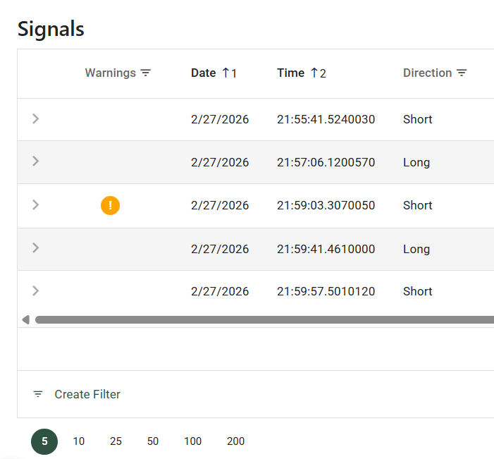
If an orange "!" mark appears in the Warnings column, it indicates that the Statistics Server could not reproduce the Signal with 100% precision. This is often due to the extreme complexity of slicing high-frequency tick data.
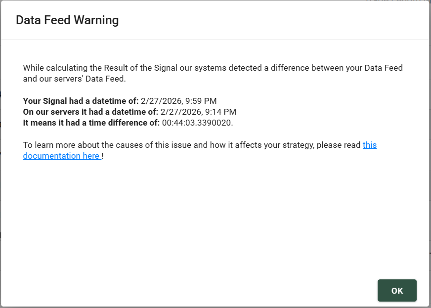
Clicking the warning icon reveals exactly how the system fitted the Signal to the market data and specifies the timestamp difference (latency) involved in the reproduction.
Signal Life Heatmaps
This feature needs data from every Bar of each Trade. Because of this, this feature can be only used with Statistics - Trade Visualization product. See our Statistics products here.
The Signal Life Heatmaps provide a deep, bar-by-bar visualization of how your Trades behave immediately after a Signal is triggered. Instead of just looking at the final outcome of a Trade, these heatmaps allow you to see the "journey" of your Signals over time (measured in Bars).
By analyzing the density of price action at specific intervals, you can discover hidden patterns about your strategy's momentum, DrawDown, and peak profitability, allowing you to optimize your exit rules with surgical precision.
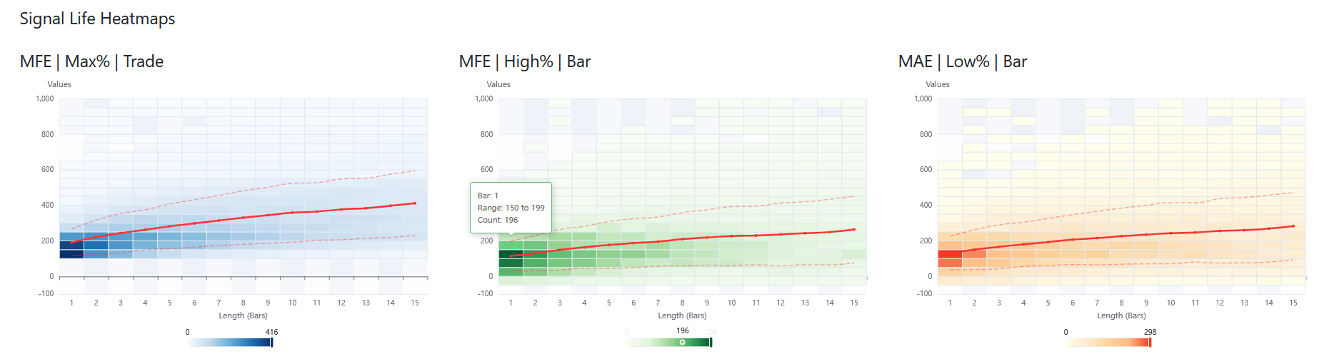
Example Signal Life Heatmaps.
Types of Heatmaps
The platform offers three distinct perspectives on Signal life, each color-coded for quick identification:
1. MFE | Max% | Trade (Blue)
This heatmap tracks the Maximum Favorable Excursion (MFE) of the Trade as a whole. It shows the highest profit percentage the Trade has reached up to that specific bar. Because this tracks the cumulative peak of the Trade, values here will only stay flat or go up as time progresses.
2. MFE | High% | Bar (Green)
This heatmap tracks the Maximum Favorable Excursion (MFE) of the individual bar's High (from the OHLC data). It shows how far price pushed favorably during that specific bar. This is highly useful for measuring bar-by-bar upward momentum.
3. MAE | Low% | Bar (Yellow)
This heatmap tracks the Maximum Adverse Excursion (MAE) of the individual bar's Low. It shows how far price pulled back against your position during that specific bar.
While the Blue (Max% | Trade) chart shows the running peak of the whole Trade, the Green (High%) and Yellow (Low%) charts look strictly at the extreme price limits of each individual bar. Use the blue chart for overall Trade potential, and the green/yellow charts for granular price action analysis.
Reading the Heatmap
To get the most out of this tool, it is important to understand the visual elements that make up the chart.
The Color Blocks & Density Slider
The chart is broken down into a grid. The horizontal axis represents the Length in Bars (time passed since the signal), and the vertical axis represents the Values (percentage points).
- Darker Blocks: A high concentration (count) of Trades fell into this specific value range at this specific time.
- Lighter/Empty Blocks: Few or no Trades reached this value range at this time.
- The Density Slider (Visual Map): Located at the bottom of the chart, this slider shows the color scale from 0 to the maximum number of overlapping Trades. You can drag the handles on this slider to filter the heatmap, hiding low-density outliers to focus only on the core clusters of your data.
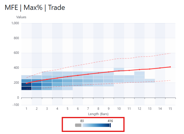
Signal Life Heatmap's slider.
The Trend Lines
When a heatmap contains enough data, three red lines will overlay the blocks to help you instantly gauge the statistical trend:
- Solid Red Line (Weighted Mean): This is the average trajectory of your Trades. It shows the most mathematically probable path your strategy takes over time.
- Dashed Red Lines (+1 and -1 Standard Deviation): These lines represent the statistical "envelope" of your Trades. Roughly 68% of all your Trades fall within these two dashed lines.
If the standard deviation lines are very wide, it means your strategy's price action is highly volatile and unpredictable. If the lines are tight around the solid mean line, your strategy behaves very consistently.
Practical Examples and Use Cases
Signal Life Heatmaps are not just for review; they are actionable tools for building better Trade management rules.
1. Optimizing Stop Loss Placement (Using the Yellow MAE Chart)
If you look at the MAE | Low% | Bar chart, you can clearly see the maximum pain your winning Trades endure before turning profitable.
- Action: Look for the darkest clusters of data on the yellow chart, and note where the bottom dashed red line (-1 StdDev) sits. Placing your Stop Loss just slightly below this dense area ensures you give the Trade enough "breathing room" to survive normal volatility without being stopped out prematurely.
2. Perfecting Take Profit Targets (Using the Blue Max% Chart)
By looking at the MFE | Max% | Trade chart, you can identify where your Trades typically "stall."
- Action: If the solid red mean line flattens out around the 8th bar, and the dark blue blocks stop climbing higher, it means holding the Trade past 8 bars rarely results in more profit. You can use this data to set a time-based exit (e.g., "Close Trade after 8 bars") or set a hard Take Profit order exactly where the densest clusters peak.
3. Identifying "Dead" Trades
If you notice on the Green or Blue charts that the bulk of the density sits near zero for the first 3-4 bars, it means your entries might be slightly premature, or the asset tends to consolidate immediately after a signal. You might use this insight to delay your entry or require a secondary confirmation before pulling the trigger.
Main Metrics
This list contains the core metrics and fundamental information for the Statistics Request.
| Term | Definition |
|---|---|
| User Tag | Your custom label used for organizing and identifying the Request. |
| Automatic Tag | A system-generated string of key settings concatenated for quick identification. |
| Time Zone | The specific Time Zone you designated in the Request Settings. |
| Signal Count | The total number of Signals uploaded in the Request. |
| Short Signal Count | The total number of Short Signals uploaded in the Request. |
| Long Signal Count | The total number of Long Signals uploaded in the Request. |
| Trade Count | The number of Signals that successfully converted into active Trades. |
| Short Trade Count | The number of Short Signals that successfully converted into active Short Trades. |
| Long Trade Count | The number of Long Signals that successfully converted into active Long Trades. |
| Instrument | The trading Instrument used for the simulation. |
| TimeFrame Value & Type | The specific Timeframe setting (e.g., Range, Time, or Trades) and its value. |
| Average RR per Trade | The average Risk/Reward ratio achieved across all executed Trades. |
| Total Result (USD) | The final net profit or loss at the end of the simulation period. |
| Full Broker Cost (USD) | The total accumulated Round Turn Commission costs for all Trades. |
| Trade Visualization | Indicates Yes or No based on the Statistics Product used to process the Request. |
Statistics Settings
This section lists the specific Statistics Settings used for the current Request. To learn more about the function of each individual setting, please refer to the Settings Documentation.
The settings are organized into logical categories for easier navigation. You can expand or collapse the details for each category using the chevron (arrow) icons.
DrawDowns
This graph provides a visual representation of all significant DrawDown Periods overlaid on your Equity Curve.
- Red vertical lines: Indicate the start of a DrawDown Period.
- Black vertical lines: Indicate the end of a DrawDown Period.
Only DrawDown Periods with a total balance loss equal to or greater than your configured threshold are displayed. You can adjust this threshold in your Account Settings.
DrawDown Periods
A DrawDown Period represents a section of the Equity Curve (or account balance) spanning from the moment the balance begins to drop until it recovers and exceeds the previous peak value.
Statistics tracks the most significant DrawDown Periods. If one DrawDown Period fully encompasses another smaller one, only the larger period is retained.
DrawDown Periods are displayed in a data grid, sorted by their Size in USD in descending order.
| Column | Description |
|---|---|
| Start Date Time | The timestamp when the DrawDown Period began. |
| End Date Time | The timestamp when the DrawDown Period concluded (left empty if still ongoing). |
| Total Days | For how many days did the DrawDown Period last. If is truncated to a whole day. |
| Size in USD | The total depth of the DrawDown Period from peak to trough. |
| Percentage | How much of the balance was lost during the DrawDown Period. |
| Start Value | The Equity Curve or account balance at the start of the DrawDown Period. |
| Low Value | The lowest balance value reached during the DrawDown Period. |
| Is Finished | Indicates whether the DrawDown Period has concluded or is still active. |
DrawDown Sequences
A DrawDown Sequence tracks consecutive losing Trades.
Tick2Tick Statistics monitors two specific types of DrawDown Sequences, detailed in the following paragraphs.
Max Losing Trade Sequence
This metric identifies the highest number of consecutive losing trades. For example, a value of 15 means that 15 Trades in a row were reset with an RR below 0. The system provides the exact timestamps for when this sequence started and ended.
Max Lost USD
This metric identifies the maximum capital lost (in USD) during a sequence of losing trades. For example, a value of -$2,000 USD means that a series of consecutive losing trades resulted in a $2,000 loss before a winning trade occurred. The system provides the exact timestamps for the start and end of this sequence.
Ignored Signals
This data grid lists any Signals that were excluded from the calculation. Signals are typically ignored for the following reasons:
| Reason | Description |
|---|---|
| Vertical Threshold Limit | Occurs when the Statistics Servers cannot match the Signal's metadata (timestamp, levels, or direction) to our market data. This is usually caused by misconfigurations in the Request Settings or, occasionally, during futures contract rollover periods. |
| Matching Timestamp | Occurs when multiple Signals are uploaded with the identical timestamp and direction. Our system retains only the first Signal and ignores the duplicates. |
Ignored Signals are not simulated and do not consume any Statistics Trade Credits (STCs).
Export Result
All results from your Statistics Requests can be exported using the following two buttons available on the Details page:
Download Report
This button allows you to export all Signals, DrawDowns, and Summaries into a structured Excel file. This format is ideal for deep data mining or seamless integration with external tools like Power BI, Tableau, or custom analytics platforms for further research.
Print Page Contents
This option allows you to use your browser’s "Print-to-PDF" functionality to quickly generate a shareable or offline-ready version of the entire Results page. This is particularly useful for archiving your strategies or reviewing your data when an internet connection is unavailable.
For the best results when exporting to PDF, ensure that any expanded views (like Trade Life Visualized) are open before printing if you wish to include those specific details in the document.
Warnings
Data Feed Precision
In some instances, the Statistics Server may not be able to replicate a Signal with 100% accuracy. Because of how high-frequency market data is sliced, even a one-tick offset can cause OHLC bars to differ slightly between platforms and workstations.
To ensure you still receive actionable insights, the system will simulate the Trade by finding the nearest matching timestamp to your original data. When this occurs:
- An orange "!" icon appears in the Warnings column of the Signals data grid.
- You can click the icon to view the exact millisecond offset (latency) used to fit the Signal to our market data.
See example for this in these pictures:
Lost All Capital
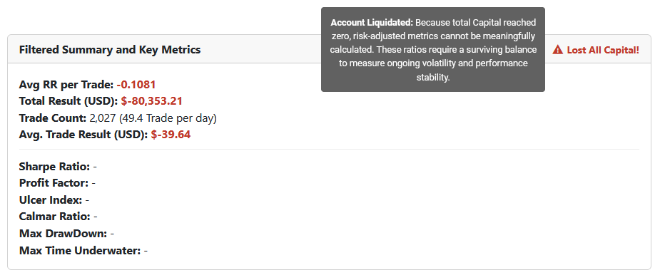
If your strategy results in account liquidation (total Capital reaching zero), a red warning icon and label will appear at the top right of the Key Metrics cards, saying "Lost All Capital!".
When an account is liquidated, risk-adjusted metrics such as the Sharpe Ratio, Profit Factor, Ulcer Index, and Calmar Ratio cannot be meaningfully calculated and will display as empty values ("-"). This is because these performance ratios require a surviving account balance to properly measure ongoing volatility and performance stability.
See example for this warning:
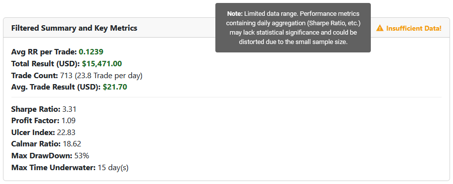
Insufficient Data for Key Metrics
If your Statistics Request covers a period of less than 180 days, an orange warning icon and label will appear at the top right of the Key Metrics cards, saying "Insufficient Data!".
This serves as a reminder that small sample sizes can distort complex risk-adjusted metrics such as the Sharpe Ratio, Ulcer Index, and Calmar Ratio. In shorter simulations, statistical outliers have a disproportionate influence, which may lead to an inaccurate representation of the strategy's long-term viability.
See example for this warning: