Core UI Components
This guide provides an overview of the key User Interface (UI) components you will encounter within the Tick2Tick Dashboard.
Data Grids
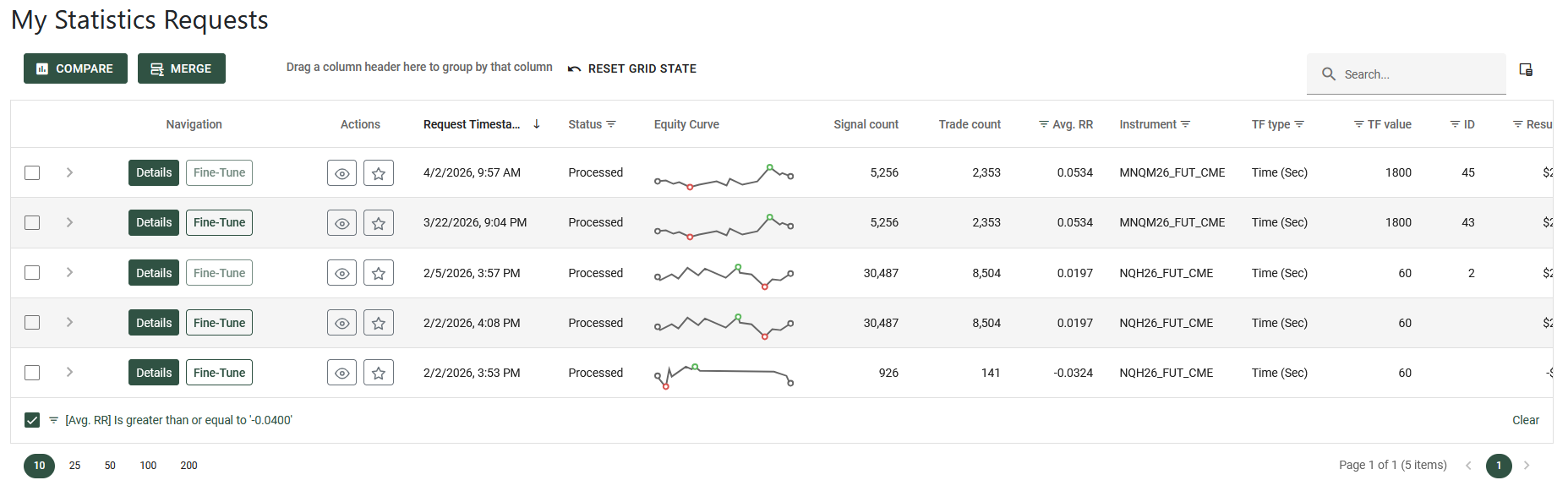
Data grids are interactive tables that form the backbone of data presentation in Tick2Tick. Similar to spreadsheets, they organize data into rows and columns. Their true power lies in the advanced features detailed below, which allow you to easily manipulate, explore, and analyze your data.
Not all data grids include every feature listed below. We design our interfaces to provide the specific tools you need for each context while keeping the experience clean and minimalist.
Example for a data grid:
Searching
The search feature allows you to quickly locate specific information across all columns and rows. Simply type your query into the search bar located at the top right corner of the data grid.
As you type, the grid automatically filters to display relevant results, highlighting matching text in green to help you spot exactly what you are looking for.
For the most accurate results, use precise and direct keywords.
Examples for this feature:
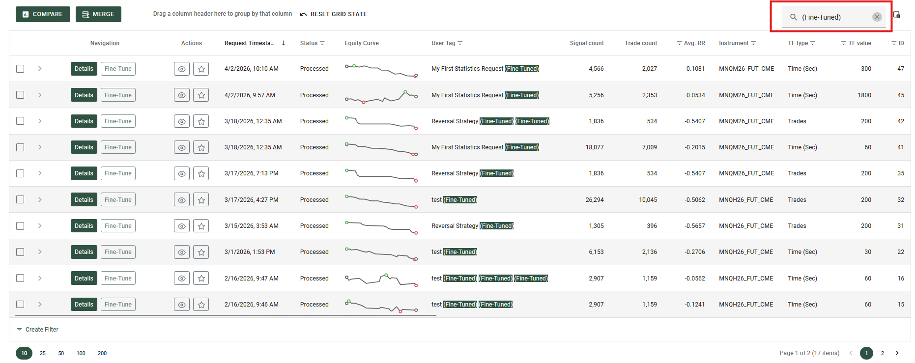
Searching for Fine-Tuned Statistics Requests.
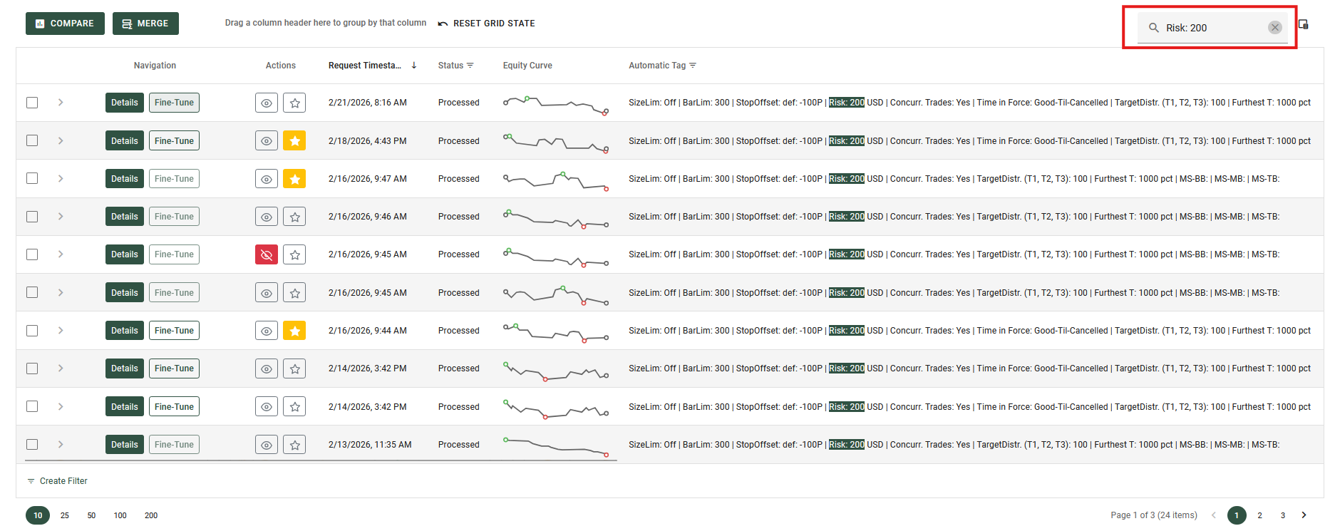
Searching for Statistics Requests containing specific Risk values (e.g., values in the 200s).
Sorting
This feature allows you to organize your data by sorting it in ascending or descending order, making it easier to find specific records or analyze trends.
Sorting by a Single Column
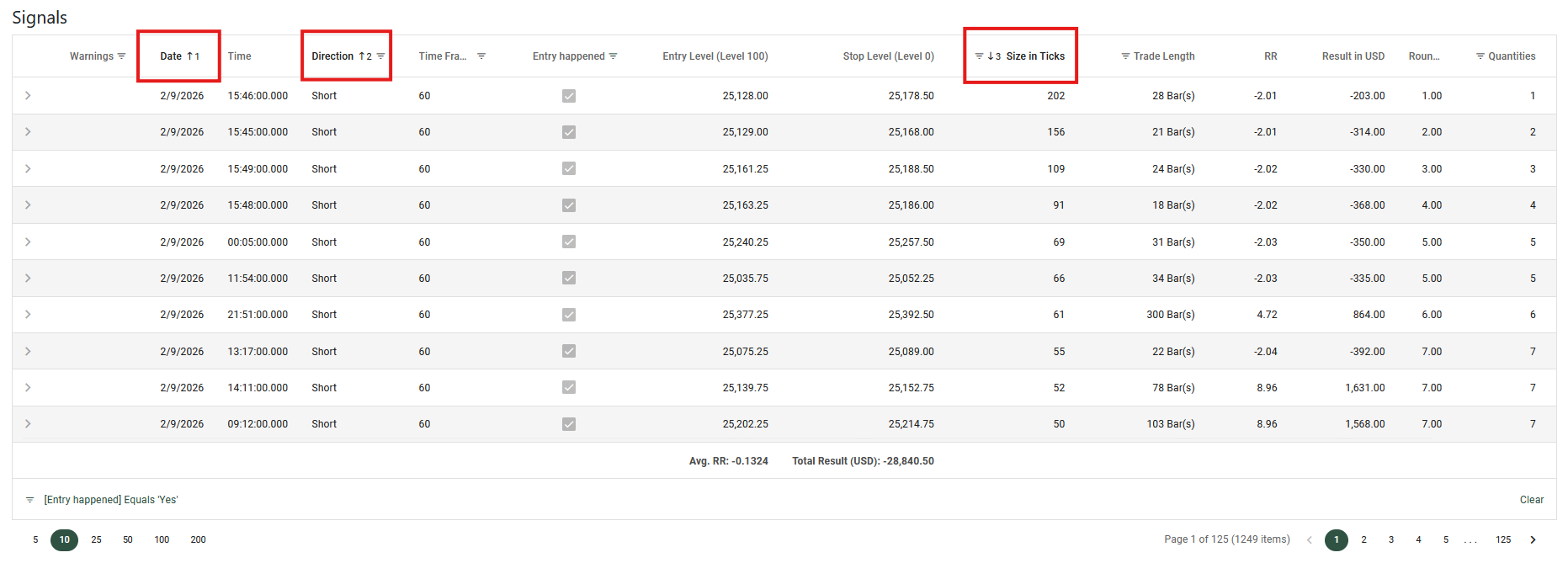
To sort the grid, simply click on a column header. An arrow will appear next to the column name to indicate the sorting direction (pointing up for ascending, or down for descending). Clicking the header again will reverse the sorting order.
Sorting by Multiple Columns
You can sort by multiple columns simultaneously to create a more detailed hierarchy for your data.
- Click the first column header to set your primary sort.
- Hold down the
Shiftkey on your keyboard. - Click the headers of any additional columns you want to sort by.
When using multiple sorting, a number will appear next to the arrow on each column header. This number indicates the column's priority in the sorting order (e.g., a "1" means it is the primary sort, "2" is the secondary sort, and so on).
Depending on the specific data grid you are viewing, sorting may be disabled for certain columns. If clicking a column header does nothing, sorting is not supported for that specific data.
Examples for this feature:
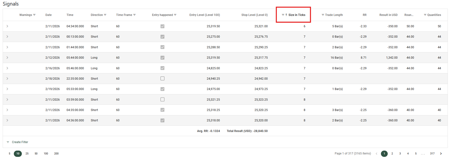
Sorting a Signals data grid by 'Size in Ticks' in ascending order.
Sorting a Signals data grid by multiple columns: Date, Direction, and Size in Ticks.
Paging
When dealing with large amounts of data, the data grid automatically divides the information into multiple pages. This keeps the interface clean, improves loading times, and makes it easier for you to browse through extensive records.
All paging controls are located in the pager area at the bottom of the data grid.
Navigating Between Pages
You can move through your data using the page navigation tools:
- Page Numbers: Click on a specific number to jump directly to that page.
- Arrow Buttons: Use the left (
<) and right (>) arrow buttons to move to the previous or next page.
Adjusting Rows per Page
You can control how much information you want to see on the screen at one time using the page size selector.
- Click the dropdown menu in the pager area (typically showing numbers like 10, 20, or 50) to change the number of rows displayed on a single page.
Viewing Data Information
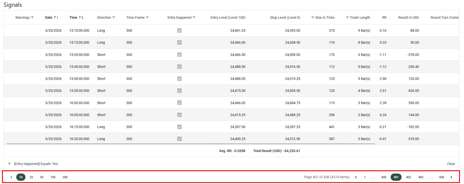
The pager area often displays a summary of your data, such as your current page, the total number of pages, and the total count of records (e.g., "Page 1 of 5 (42 items)"). This helps you understand exactly where you are within the dataset.
Example for this feature:
Grouping
Grouping allows you to categorize and organize large datasets into collapsible sections, much like folders on your computer. This makes it easier to analyze specific subsets of your data at a glance.
How to Group Data
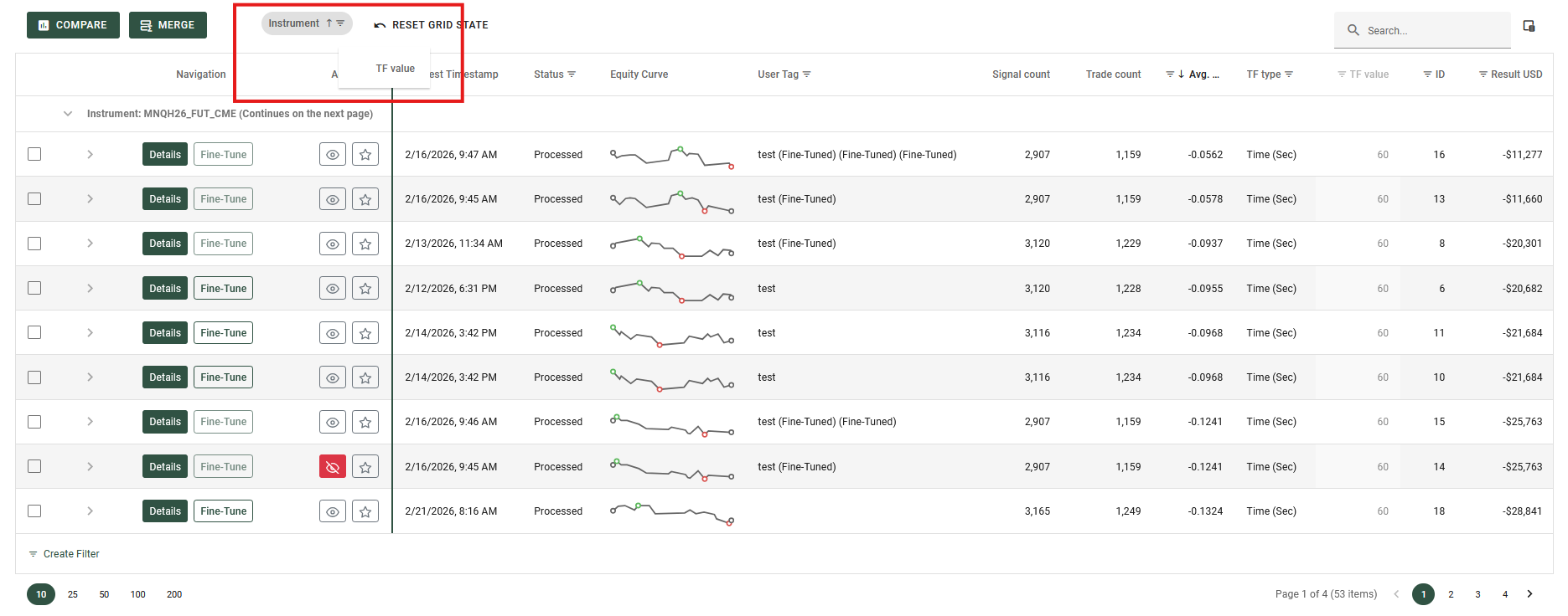
- Look for the grouping panel at the very top of the data grid (it typically displays the text "Drag a column header here to group by that column").
- Click and hold the header of the column you want to use for grouping.
- Drag and drop the header into that top panel.
You can group by multiple columns by dragging additional headers into the panel. This creates nested groups (sub-categories) for deeper organization.
Dragging a column header into the grouping panel.
Navigating Grouped Data
Once your data is grouped, you can easily interact with it:
- Expand or Collapse: Click the right/down chevron (arrow) on the left side of any grouped row to reveal or hide the underlying data records inside it.
- Sort Grouped Values: You can click the column name directly inside the top grouping panel to sort the groups themselves in ascending or descending order.
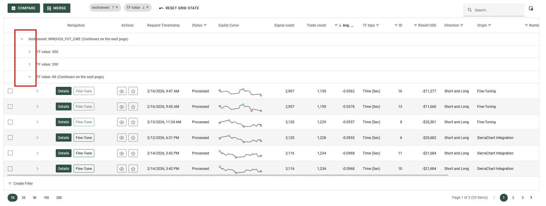
Clicking the chevron arrow to view the records within a group.
Removing Grouping
To ungroup your data, simply click and hold the column name in the top grouping panel, and drag it back down into the main column header row.
Resetting the Grid
If you have grouped multiple columns or made several layout changes, you can instantly revert everything to its original default view. Just click the Reset Grid State button (usually located near the grid's toolbar). This will clear all active groupings, sorting, and layout customizations in one click.
Filtering
Filtering helps you narrow down large datasets by setting specific conditions, ensuring the grid displays only the rows that are relevant to your current task.
Header Filters
The quickest way to filter your data is directly through the column headers.
- Hover over a column header and click the filter icon (usually a small magnifying glass or funnel) that appears.
- A dropdown menu will open. Depending on the data in that column, you can either select specific values from a checklist or define custom rules (such as "Contains", "Greater than", or "Starts with").
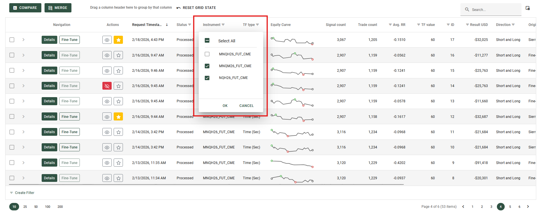
Using the column header dropdown to quickly apply a filter.
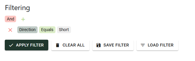
The Filter Panel and Filter Builder
Whenever a filter is applied to the grid, a Filter Panel automatically appears at the very bottom of the data grid. This panel provides a plain-text summary of your active filtering rules (for example, Filter: [Entry Happened] = true). This makes it easy to see exactly how your data is currently being restricted.
If you need to create complex, multi-layered queries, you can use the Filter Builder:
- Click directly on the filter text string (e.g., the
[Entry Happened] = truetext) shown in the bottom Filter Panel. - The Filter Builder popup will open. Here, you can visually construct advanced queries, grouping multiple conditions together using logical operators like "And" and "Or" across any column in the grid.
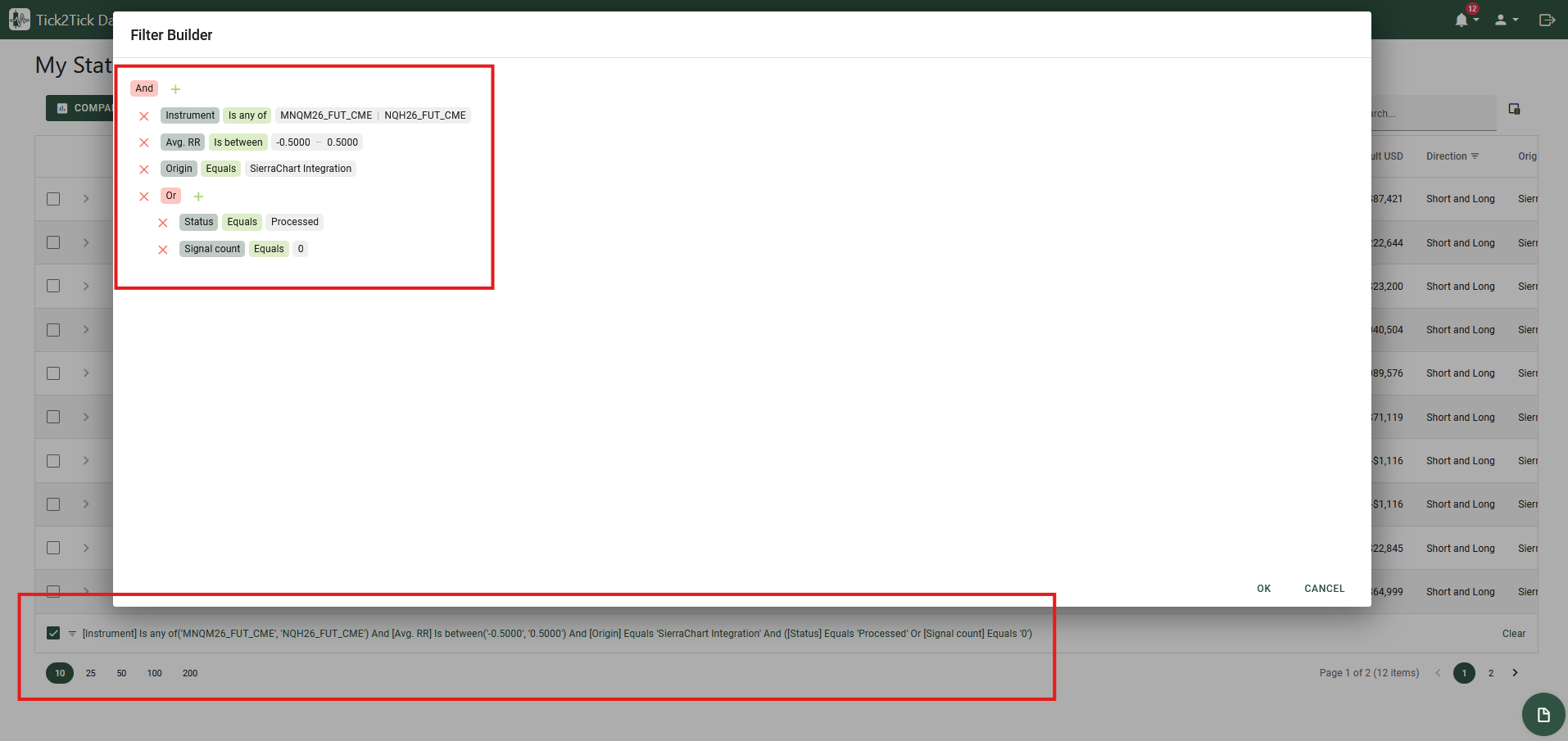
The active filter text displayed at the bottom, which opens the advanced Filter Builder when clicked.
Clearing Filters
To instantly remove all active filters and view your complete dataset again, simply click the Clear button located on the right side of the bottom Filter Panel. You can also clear individual filters by reopening the header filter dropdown for a specific column and resetting it.
Customizing Columns
You can fully customize the layout of the data grid so that it displays only the information most relevant to you, in the exact order you prefer.
Reordering Columns
To change the order of the columns, simply click and hold a column header, then drag it to the left or right to your desired position. Drop it when you see the positioning indicators appear between the other column headers.
Hiding and Showing Columns
If your grid contains information you don't currently need, you can hide specific columns. Conversely, you can reveal hidden columns that you want to see. This is managed using the Column Chooser.
- Click the Column Chooser button (a small icon looking like a customized table) located in the top-right corner of the data grid toolbar. This will open the Column Chooser panel.
- To hide a column: Click and hold the column header you want to remove from the grid, and drag it into the Column Chooser panel.
- To show a hidden column: Click and hold the column name inside the Column Chooser panel, drag it out, and drop it anywhere into the grid's main header row.
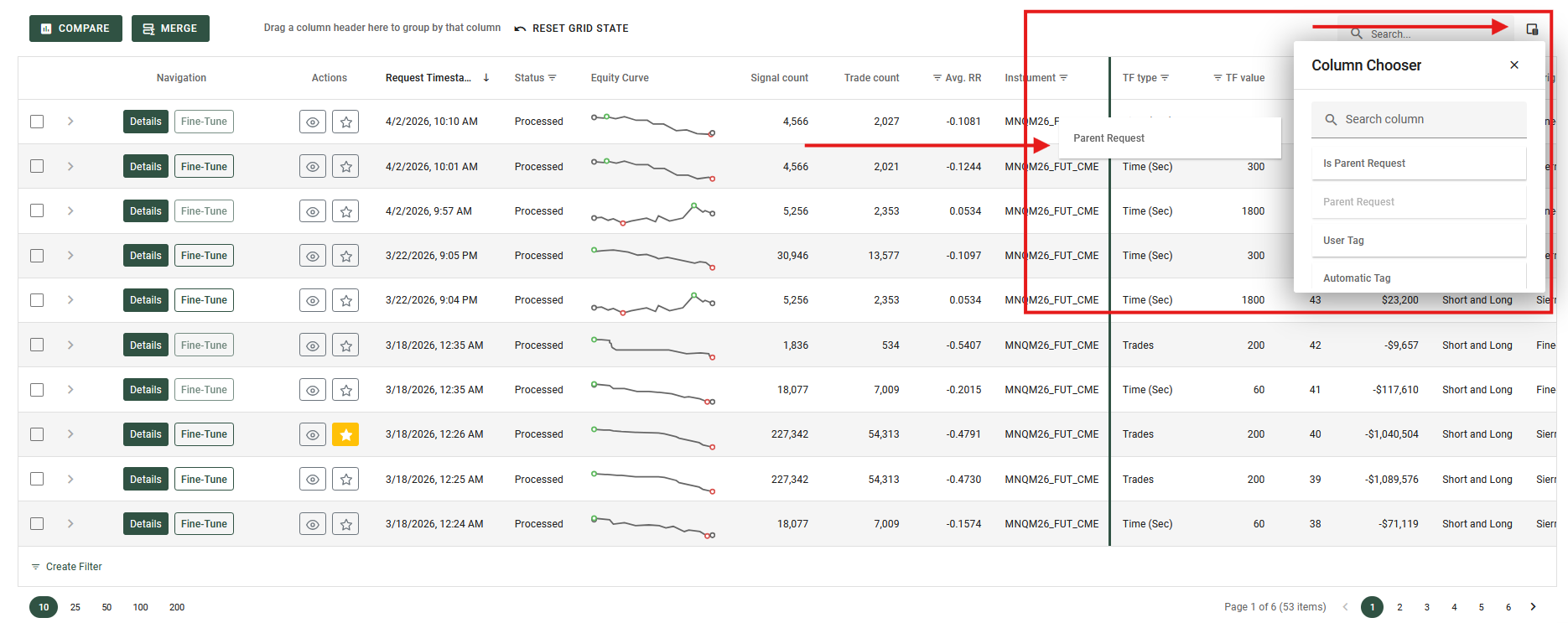
Using the Column Chooser panel to drag and drop columns to hide or show them.
Master Details
The Master Details feature allows you to view additional, in-depth information related to a specific row without cluttering the main data grid. When expanded, this feature opens a dedicated panel directly beneath the row, often containing sub-tables, charts, or detailed descriptions.
Viewing Detailed Data
- To Expand (Show Details): Look for the right-pointing chevron (arrow) at the very beginning of a row. Click this arrow to expand the row and reveal the hidden details.
- To Collapse (Hide Details): Once expanded, the arrow will change to a down-pointing chevron. Click it again to hide the detailed view and collapse the row back to its normal state.
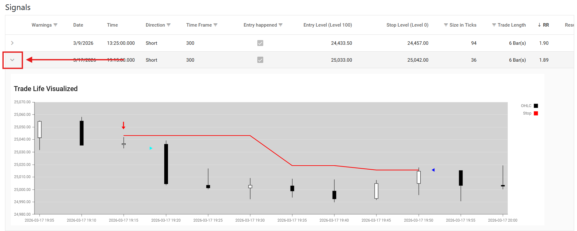
Clicking the chevron to expand a row and view its detailed data.
Live Updates
Forget about constantly hitting the refresh button. Our data grids are designed to update automatically in real-time. This means the moment new information is available, it is instantly on your screen, giving you complete confidence that you are always looking at the most up-to-date data.
For example, heck out the My Statistics Requests page in the Tick2Tick Dashboard.
To make tracking these changes effortless, the grid handles new information in two intuitive ways:
-
Instant Visual Cues for Progress: When information in an existing row updates - such as a progress bar moving forward while your Statistics Request is actively processing - you won't have to hunt for what changed. The specific cell will briefly glow, naturally drawing your eye directly to the latest update.
-
Seamless Integration of New Data: When entirely new information arrives - like when you submit a new Statistics Request - it doesn't just get dropped randomly on your screen. The grid smoothly integrates the new row into exactly the right spot based on your current sorting preferences (for example, ordered by Signal Count). Your organized workspace stays perfectly intact without you having to lift a finger.
Filter Builders
Filter Builders are powerful, visual tools used throughout the Tick2Tick Dashboard to help you construct complex, highly specific data queries. While you may encounter a Filter Builder at the bottom of a data grid, they are also used as standalone components when setting up advanced data requests or configuring templates, allowing you to build intricate filtering logic.
How to Build a Filter
The Filter Builder uses a tree-like structure consisting of Groups (logical operators like "And" / "Or") and Rules (the specific conditions you want to apply).
Adding a Basic Rule
- Click the plus icon (+) next to the main logical operator (usually starting as "And").
- Click Add Condition.
- Select the Field: Click the first highlighted text (usually defaulting to a field name) to choose the specific metric or column you want to filter by from a dropdown menu.
- Select the Operator: Click the middle text (e.g., "Equals") to define the relationship. Options typically include "Contains", "Is greater than", "Starts with", "Is any of", etc.
- Set the Value: Click the last highlighted text (often
<enter a value>) and type or select the value you are looking for.
Creating a basic filtering rule defining the Field, Operator, and Value.
Using Logical Operators
The true power of the Filter Builder is the ability to combine multiple rules using logical operators.
Click on the root operator (e.g., the word And) to change how the rules within that group interact:
- And: Every single rule in this group must be true for the data to be included.
- Or: If at least one rule in this group is true, the data will be included.
- Not And / Not Or: The inverse of the above, actively excluding data that matches those conditions.
Creating Nested Groups
For advanced scenarios, you can group rules within other groups. Instead of clicking "Add Condition" from the plus icon (+), select Add Group. This creates a new sub-level with its own logical operator, allowing you to build queries like: (Rule A AND Rule B) OR (Rule C).
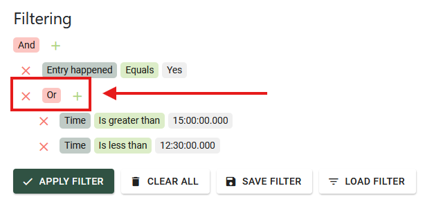
A complex filter using nested groups and different logical operators.
Charts and Graphs
The Tick2Tick Dashboard features interactive charts and graphs to help you visualize your trading performance and statistics. Many of these charts support advanced interactions to help you dig deeper into your data.
Zooming and Panning
When analyzing large distributions or detailed histograms (such as the Distributions of Trade RRs), you can zoom in to inspect specific sections of data and pan across the graph to explore nearby values.
Zooming by Dragging
You can quickly zoom into a specific area of the chart by clicking and dragging your mouse across the graph. This draws a selection window, and when you release your mouse button, the chart will zoom directly into that chosen range.
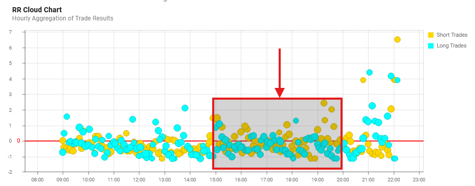
Zooming into a specific data range on a histogram.
Zooming with the Mouse Wheel
For precise, dynamic zooming:
- Hover your cursor over the chart area.
- Hold down the
Shiftkey on your keyboard. - Scroll your mouse wheel up (to zoom in) or down (to zoom out).
Panning Across the Chart
Once you are zoomed in, some of your data will be hidden off-screen. To navigate through this data without zooming back out:
- Hold down the
Shiftkey. - Click and drag the chart left or right to pan (scroll) through the zoomed-in timeframe or data range.
Customizing Data Series
Complex charts often display multiple data series simultaneously—such as the Sum of USD, Broker Costs, and Total Results. You can customize the view to focus only on the metrics that matter most to you.
Hiding and Showing Series via the Legend
You can easily toggle individual data series on and off using the chart's legend.
- To Hide: Click on a series name inside the legend. That specific line or bar will disappear from the chart, allowing you to isolate the remaining data.
- To Show: Click the hidden series name in the legend again to restore it to the chart.
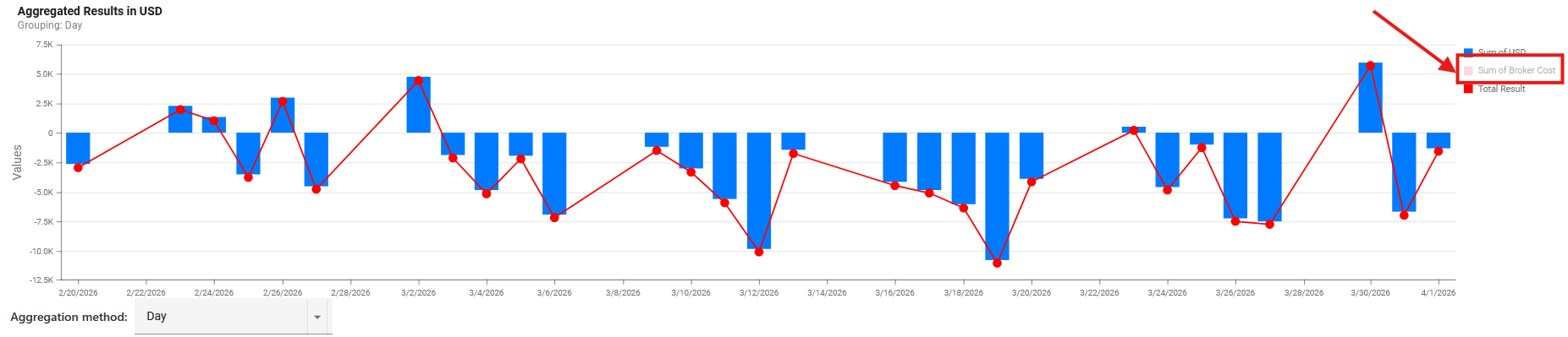
Clicking legend items to toggle the visibility of specific data series.
Changing Time Aggregation
For charts that track performance over time, you will often see an Aggregation method dropdown menu located just above the graph.
This tool allows you to change how your data points are grouped. For example you might be able to customize the timespan of your requested data, by switching between Hour, Day, Week, or Month aggregation modes. Changing this setting instantly recalculates and redraws the chart, letting you seamlessly switch between analyzing short-term execution and long-term trends.